How to Place People & Trees in Your Drawings
UNSURE HOW TO PLACE ENTOURAGE TO COMPLEMENT YOUR DESIGN?
FOLLOW THESE RULES.
There are certain composition rules to be followed when placing entourage, trees and people in this case, to complement a building in a drawing or a sketch. Note that these rules might change slightly according to a form of a building.
In this blog post, we’ll go through some common mistakes when placing entourage and explain the do’s & don’ts on examples.
Note that these following considerations don’t take into account some factors which are usually considered as a part of architectural or landscape design, such as weather conditions, orientation, soil properties, and overall site analysis. This article offers advice on composition of a drawing or a sketch.
PLACING A TREE
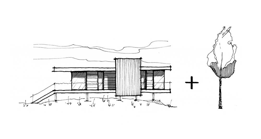
Let’s start with placing a tree in an elevation sketch.
DON’Ts
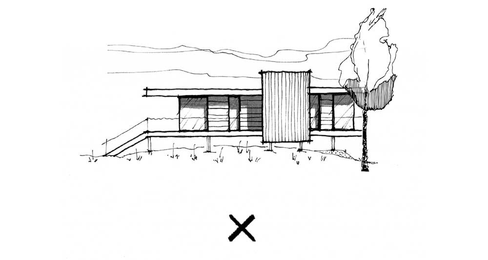
A tree is aligned with an edge of a building, creating a visual tangent. Never align it in a way where its axis directly overlaps with a vertical edge.
A tree is covering the architectural accent of a building.
A tree is placed directly in the middle of a building.
Such type of tree and its placement doesn‘t complement a building‘s form.
DO’S
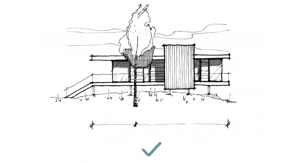
Now that we’ve seen the wrong ways, let’s take a look at some correct options of placing a tree in this elevation.
Such vertical tree complements the horizontal form of a building and its placement balances out the composition.
Optionally, such tree can be used when positioned properly.
Placing People
In this section of the article, we compare always 2 scenarios of populating a single drawing and explain what to avoid, why, and how to do it better.
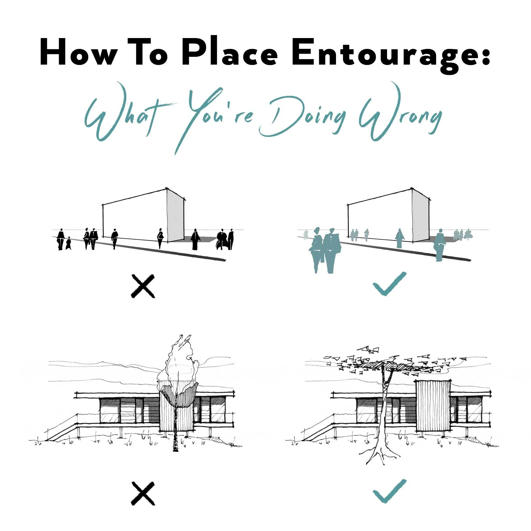
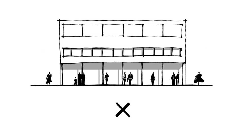
The repetitive and equally distant distribution of people competes with the building‘s rhythm.
People create groups and complement the rhytmical facade by their uneven distribution.
TIP: Always try to use entourage or any secondary graphic elements of a drawing to complement your design‘s form and features.
Download my library of 190 hand-sketched people and trees as Photoshop + Procreate brushes and raster & vector images. Speed up your workflow and have fun pimping your drawings and illustrations with these ready-to-use brushes & graphics.
* includes how-to videos and installation guides
Human figures (or any other entourage) should never be placed directly on a geometrical axis of important elements such as a gable, windows, or an edge of a building.
People are placed to complement the overall composition of the elevation.
TIP: By intentional placement of people, you can direct the viewer‘s attention towards important parts of a drawing to highlight the benefits of your design.
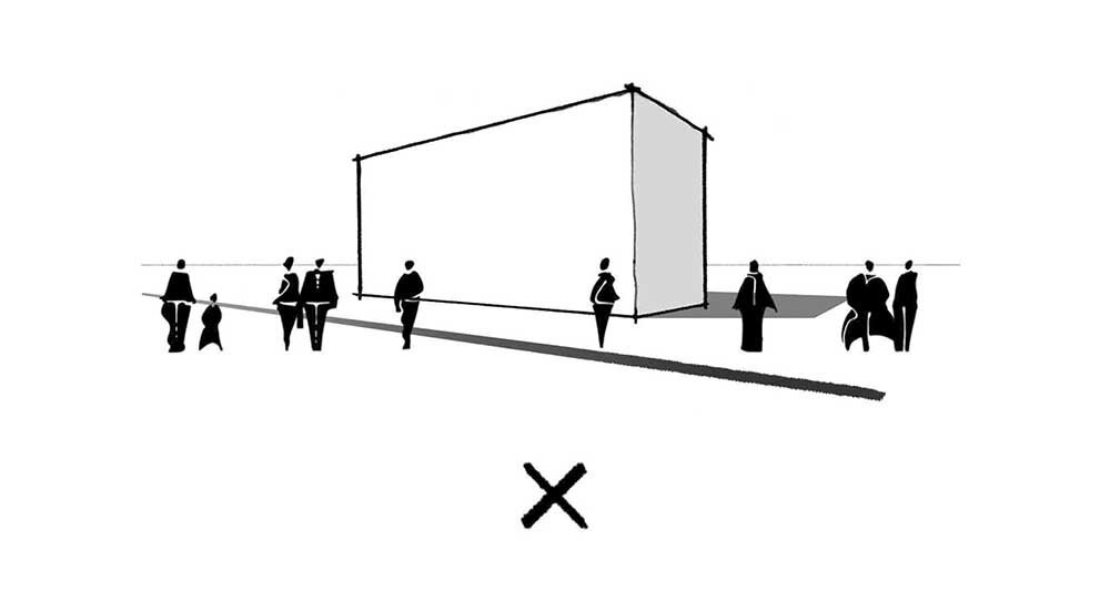
All human figures are placed in the same level of depth which makes the image look more flat.
The distribution of human figures supports the illusion of depth in perspective.
So these are the do’s and don’ts when it comes to placing entourage in your drawings or sketches. Have you ever made any of these common mistakes? Let me know in the comments below.

